Gender Marketing: How Brands Use the Power of Colors To Persuade You
RB
Last updated 03/21/2024 by
Rolla BahsousHave you ever wondered why men’s body products are always in shades of gray and red? Or why many female products are pink and flowery? These design choices aren’t random, nor are they solely chosen for aesthetic appeal.
Get Competing Personal Loan Offers In Minutes
Compare rates from multiple vetted lenders. Discover your lowest eligible rate.
It's quick, free and won’t hurt your credit score
Positioning and Image Creation
Many companies rely on advertising to sell their image, product, and brand. As contemporary semioticians (those who study signs, referents, and meanings) note, advertisers use two main techniques to sell products or brands: positioning and image creation.
Positioning refers to having a defined targeted marBket for a brand or product. Image creation are the personality/characteristics attributed to the product or brand visually. This is where colors become useful and why they are carefully chosen by design teams. The use of color provides a non-verbal signal that helps persuade us that we, as consumers, need to buy this or that product or brand. (O’Shagnessy and Stadler).
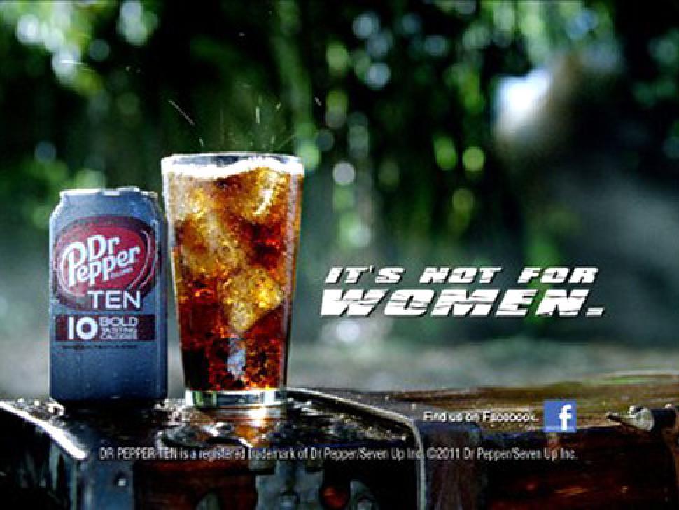
Colors are powerful, not only because they become associated with a brand logo or image, but because of the connotations society attaches to them. Apart from the statement “It’s not for women” in the diet soda ad above, what makes it manly?
Gender Specific Colors: Pink is for Girls!
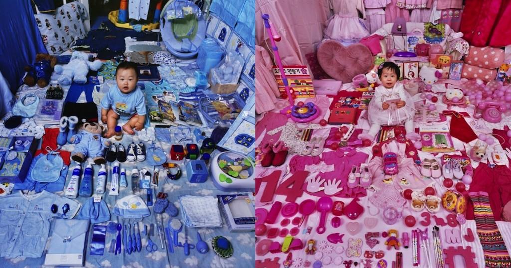
It is hard to not associate blue with boys and pink with girls, from infancy to adulthood. Walk through any toy store and you’ll find an aisle or two packed to the gills with pink-dressed baby dolls, dollhouses and costumes. An aisle over, you’ll find toy trucks, guns, building blocks and toy soldiers in hard colors like black, blue, green and red. Parents will find pink and purple outfits for their little girls and blue and green outfits for their boys.
It’s gotten to the point that if a girl is put in “baby boy blue” she’s easily mistaken for a boy, and vice versa. And funny enough, gender neutral colors like cream and yellow are only making it worse.
Color Stereotypes Haven’t Grown Up

Color stigmas and stereotypes continue well into adulthood. Cosmetic brands design their female-targeted products with the same delicate hues, though perhaps a little sleeker. Shiner purple, hotter pinks, for example. Male products often contain bolder colors like black and blue, to appeal to men as more “masculine” and “strong.”
Fragrances are a great example of this. When was the last time you saw a perfume bottle in a striking black, or a cologne with pink and sparkly embellishments?
Another example, shaving tools and creams. Take a walk through any personal hygiene department and you’ll find little pink razors packaged with flowery graphics, sparkles and even clouds. A few steps farther, you’ll see black razors with grey packaging and straight lines, no frilly graphics in sight. You might even find that comparable razors from the same company, one for “her” and the other for “men,” cost differently, with the pink razor costing slightly more. New monthly subscription service Dollar Shave Club calls this the Pink Tax.
Why Does Color Marketing Work?
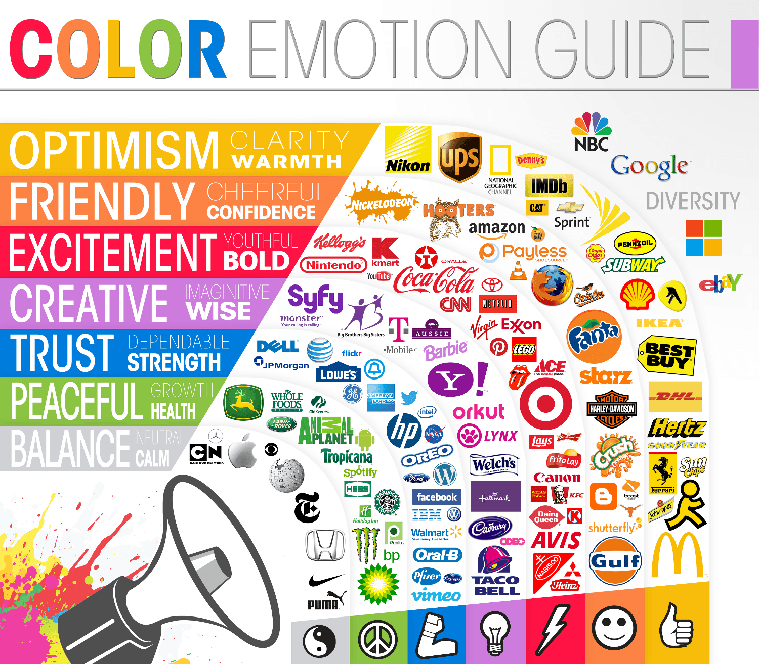
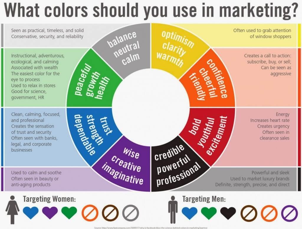
Most will look at the graphic above and agree with the colors and their associated emotions and logos. Yellows convey warmth, happiness, and clarity, and are prominent in Subway, Denny’s and Sprint’s marketing. On the other end of the spectrum, shades of gray show neutrality and calm, like the Apple and Wikipedia logo.
For many, that’s the end of the conversation. Pink appeals to women because it’s girly, black and blue to men because they’re strong. Marketing departments have figured out the formula, it’s been instilled in us as consumers since before we even knew anything about colors, and that’s just the way it is.
Gregory Ciotti from Help Scout dismisses this idea swiftly, and calls it a vapid conversation “about as accurate as your standard Tarot card reading.”
“…in regards to the role that color plays in branding, results from studies such as The Interactive Effects of Colors show that the relationship between brands and color hinges on the perceived appropriateness of the color being used for the particular brand (in other words, does the color “fit” what is being sold).The study Exciting Red and Competent Blue also confirms that purchasing intent is greatly affected by colors due to the impact they have on how a brand is perceived. This means that colors influence how consumers view the “personality” of the brand in question (after all, who would want to buy a Harley Davidson motorcycle if they didn’t get the feeling that Harleys were rugged and cool?).” (Help Scout)
How well would a pale pink and bedazzled Harley sell? Because the Harley Davidson brand’s personality is perceived as rugged, tough, classic and cool, probably not all that well.
Likewise, a dark gray Venus razor with a straight, not fancifully curved, handle would likely confuse female consumers. It wouldn’t attract male users because of the perception and connections made with Venus razor and femininity. So what did Gillette do? They produced the same razor in black and green, but called it Gillette Body. They also nixed the “passion,” “embrace,” and “sensitive” terminology and instead put “engineered.” Because science.
Take a second to remember the Bic Cristal Pen for Her, not to be confused with a pen used for writing down actual thoughts and knowledge, but one used for drawing pretty things and being delicate.
Masculine Branding to Appeal to Women
We all know that brands that promote anti-aging products will often use jargon that sounds scientific to persuade the average consumer that their products will get rid of wrinkles. And because many beauty products rely on universal myths, like the quest for youth and sexual attractiveness, these products are extra popular.
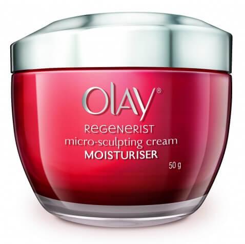
But why aren’t these products packaged in more feminine colors? Why are anti-aging products targeted at women (like Olay’s Regenerist anti-wrinkle line) packaged in reds, grays or dark blues? Aren’t these colors are usually associated with masculinity?
Anti-aging brands use colors associated with masculinity in order to persuade their consumers that they can also associate their brand with authority and power. After all, their products are supposed to be scientifically-proven to work. Again, science and facts are connected to masculine colors. Would these anti-aging products have the same effect if they were packaged in light purple hues? Probably not.
Metrosexual Marketing: Are You as confused as we are?
Taking a step back from associating brands with specific genders and personalities, let’s look at gender-specific products themselves, like facial moisturizer and mascara.
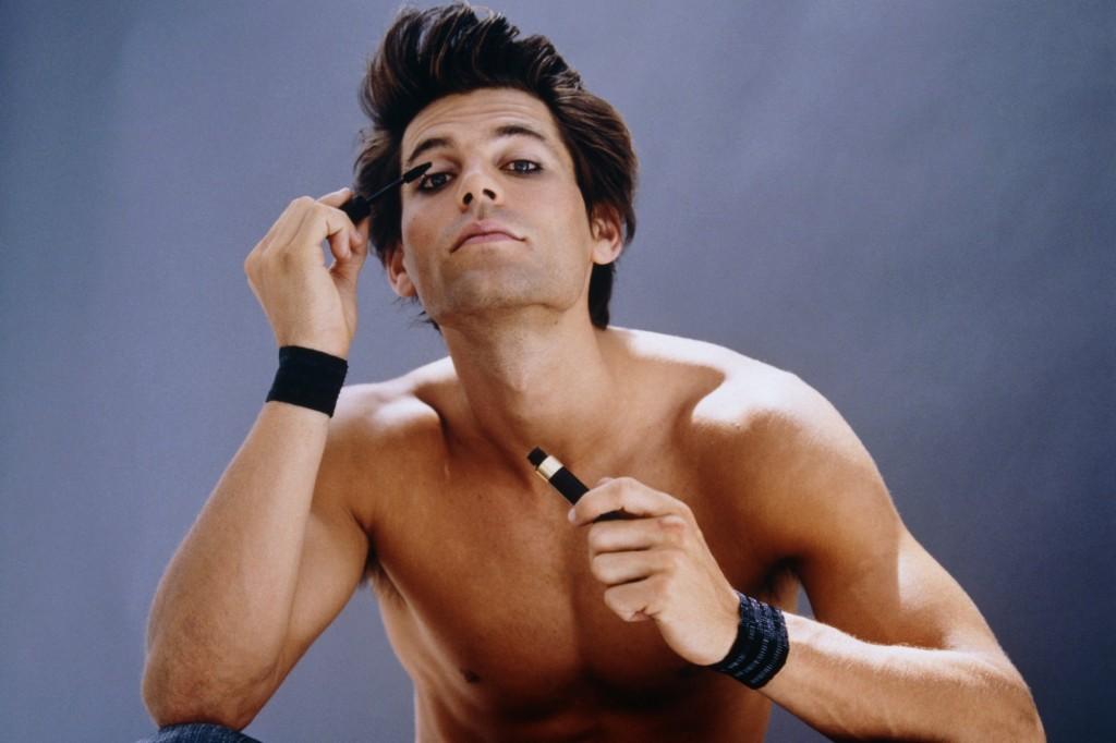
In her article “Real Men Do Wear Mascara: Advertising Discourse and masculine identity,” Claire Harrison examines the rise of the metrosexual economy in the past 10 years by examining the advertising and branding of male mascara – what L’Oreal calls, “Manscara.”
Harrison notes that male mascara is given traditional masculine qualities, such as efficiency and speed, emphasized in the slogan, “Two strokes and you’re out!”.
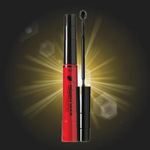
The colors used in the packaging and advertising of these male mascaras are powerful and authoritative colors like black and red, in order to persuade male consumers that this product is still masculine.
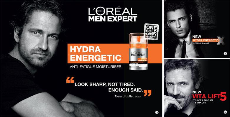
And like female-targeted anti aging creams, L’Oreal’s “Men Expert” line puts the focus on science, expertise, and masculine logic.
The manly branding works to lure in the male consumer, despite the feminine connotations of beauty products, and make them conscious of their appearance. What do most people do when they’re feeling self-conscious? They buy things.
The Impact of Color and Design in Marketing
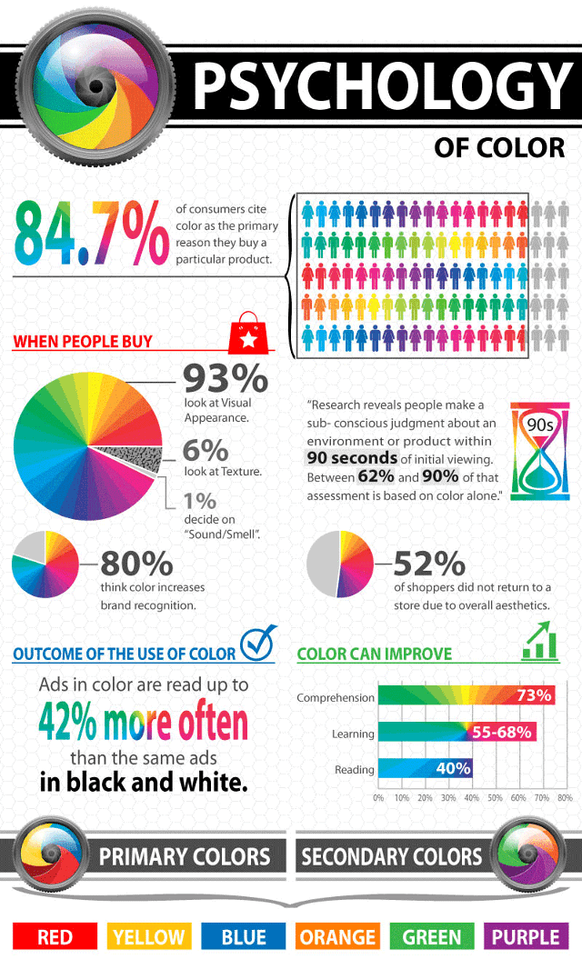
“In an appropriately titled study called Impact of Color in Marketing, researchers found that up to 90% of snap judgments made about products can be based on color alone (depending on the product).” (Help Scout)
Combine color combinations in marketing with an individual’s cultural background, upbringing, and shopping preferences and you’ve got the perfect recipe for a color-guided shopper.
One could say that the color argument boils down to gender identity and insecurity. Will this product make me more attractive? Is this popular with others in my peer group? Will it help me fit in? Is this pretty, flirty, sexy? Will this make me appear strong, manly, and also sexy?
A final factor in the argument for color and design marketing is how men and women shop. Generalizing, of course, a woman is more likely to stop and consider their options when shopping, study the packaging, and find value in the appearance of the final product. Male shoppers keep it simple, grabbing the staple items they use and scurrying out of the store as fast as possible. In fact, most men don’t even notice the packaging (unless it’s pink), just the brand name and where it usually sits on the shelf. After all, men buy, but women shop.
What do you think about color-based marketing? Do you feel your shopping habits are influenced by packaging and colors? Is it a necessary evil for the marketplace?
This article was written by staff writers Rolla Bahsous and Brenda Harjala.
Need cash in a hurry but don’t know which personal loan company you can trust? Supermoney is here to help you find the best personal loan lenders for all you loan needs.
Share this post: