
Industry Study
Housing Prices Have Not Changed All That Much In The Last 40 Years
Last updated 08/03/2025 by
Andrew Latham
Summary:
While it’s often stated that home prices have skyrocketed, a deeper look reveals a nuanced reality. Adjusting for inflation, the price changes aren’t as steep as nominal values suggest. This article explores the true state of housing prices, taking into account factors like inflation, average home sizes, and wages. We delve into how these factors interplay to shape the current housing market, highlighting the significant role of interest rates and living standards in influencing affordability.
The average sales price of a home has increased by more than 2000% since 1963.
In 2024, the median sales price of a home was $417,000. That is 23 times the $18,000 average sales price in 1963! How can you say housing prices haven’t changed? As usual, the devil is in the details. We are not saying housing is cheap or affordable for most people but there is more to housing prices and housing affordability than meets the eye.
Compare Home Loans
Compare rates from multiple vetted lenders. Discover your lowest eligible rate.
Inflation-adjusted house prices paint a more accurate picture
First, as you can see from the graph above, the median price of homes is significantly lower than the average. The average price of homes can be distorted by houses that sell for very high or low prices. Median prices are usually a more reliable measure of the typical home price.
Second, you need to take into account inflation to understand how prices have really changed. Sure. Maybe the median price of a house in 1963 was $18,000. But the average wage was also $4,500. A gallon of gas cost 30 cents. And you could buy a dozen eggs for 55 cents.
The graph above shows the median inflation-adjusted house prices from 1963 to 2023. The price hike is not as dramatic, you can still see that house prices are much higher than historical averages. This could indicate we are are coming out of another housing bubble similar to the one in 2005/2006. But there is another factor to consider.
Case-Shiller indices
Another way to compare the cost of housing over time is to use repeat-sales indices, such as the Standard & Poor’s CoreLogic Case–Shiller Home Price Indices. There are several Case-Shiller indices which are based on original work by economists Karl Case and Robert Shiller, who studied home pricing trends by comparing repeat sales of the same homes. The graph below shows the inflation-adjusted Case-Shiller and Real Building Cost indices for the United States from 1898 to 2019.
The inflation-adjusted Case-Shiller index peaked in 2022 at 310.75 and has dropped since. Although the index is still historically high, we are not for off from the 2007 peak. By the end of 2019, the Case-Shiller index was similar to that of 2005, which was when Robert Shiller published the second edition of Irrational Exuberance and expressed concern about the sustainability of home prices because incomes were not keeping up with the rise in housing costs.
Wages have not kept up with housing prices
The real problem when it comes to housing affordability is not that houses are more expensive, but that wages have not kept up. After all, real estate is considered an investment so value appreciation over time is expected (even hoped for). The trouble is that the median purchasing power of Americans hasn’t grown in line with house prices.
If you adjust for inflation, the median income of Americans has only increased by about 45% from 1967. The median house sale price, however, has increased by 104%. It’s no wonder homeownership rates among Millennials are lower than for previous generations.
New houses and GDP
Are we really spending more on new houses than in the past? It may feel like new homes are more expensive than ever. However, we are spending less on new homes as a percentage of gross domestic product (GDP) than in 1963, and half what we were spending in 2005. Using GDP as a benchmark for consumer spending is not without problems. However, it does paint a picture of the residential construction industry and housing expenditure over time. The graph below shows changes in the index of money spent on new homes divided by GDP from 1963 to 2024. The index is created by multiplying new house sold by he median price of new homes and dividing by gross domestic product.
We spend relatively considerably less on new homes than we did in 1963, but the trend is rising. The graph also illustrates well the effect recessions have on house sales. Every recession from 1973 is preceded by a sharp drop in the index. This index also speaks to the volatility of the construction industry, which can fall 145 points in just 4 years (2005 to 2009).
New homes are 44% larger than 40 years ago
Inflation, stagnant incomes, and statistical outliers are not the only reasons many people cannot afford to buy a home. Our taste for larger homes is also a significant player. In 2023, the median-sized new home was 696 square feet larger than 1983. Yet, the size of homes is a factor that is often ignored.
When you also factor in inflation, the price per square foot has remained pretty stable right until 2020. Look at the price per square foot (inflation-adjusted) for new homes in the graph below.
In 2023 the price per square foot of a new home was 20% more than in 1978 when you adjust for inflation. That is a significant increase but it doesn’t sound quite as alarming as when you only look house prices without taking into consideration inflation and the size of new homes. Particularly when you think about the amenities that are now standard for new homes.
In 1978, only 8% of homes had three or more bathrooms and just 63% had air-conditioning. Now, 33% of new homes have three or more bathrooms and 97% come with air-conditioning.
Drivers of Housing Affordability
We have established that house prices haven’t changed as much as you would expect when you take into account inflation, amenities includes, and the size of new homes.However, let’s not confuse housing prices with housing affordability.
One way to define housing affordability at the national level is to look at the monetary components of housing costs as a percentage of the median household income. That is the method the Federal Reserve Bank of Atlanta uses to create its Home Ownership Affordability Monitor (HOAM) Index. As the graph below shows, housing affordability using this measure has dropped dramatically since the beginning of 2022 and we are currently at 2007 levels of housing affordability.
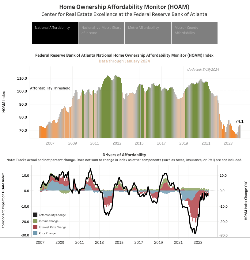
It is interesting to look at what is driving affordability (or the lack thereof). As you can see from the graph above, interest rates (not price changes) have been the major driver of reduced affordability since March 2022.

Federal Reserve Bank of Atlanta Metro Area Home Ownership Affordability Monitor (HOAM) Index
Location, as you would expect, is also a major factor. Click on the “Metro Affordability” tab of the graph above and you can see how many metro areas are affordable for the median household income.
Houses are more expensive now, even when you adjust for inflation. Wages have not kept up with the increase of prices, which compounds the problem housing affordability. But the size of the median home has also increased. In fact, the US median cost of a square foot when you adjust for inflation has remained relatively stable in the last 40 years. We spend less on new homes as a ratio of GDP than we did 1963. However, that doesn’t help if houses are larger and interest rates are increasing. House prices are, of course, not the only drivers of housing affordability, taxes, wages, and interest rates are also important. Interest rates have been the major driver of lower affordability since 2022.
Key takeaways
- When adjusted for inflation, the staggering increase in home prices over the decades is less dramatic, though still significant.
- The size of homes has increased considerably, which influences perceptions of price changes per square foot.
- Wages have not kept pace with the growth in home prices, exacerbating the affordability crisis.
- Interest rates have played a major role in reducing housing affordability since 2022, overshadowing the impact of price changes.
- Comparing spending on new homes relative to GDP shows a decrease from historical levels, suggesting changes in economic priorities or efficiencies.
Andrew is the Content Director for SuperMoney, a Certified Financial Planner®, and a Certified Personal Finance Counselor. He loves to geek out on financial data and translate it into actionable insights everyone can understand. His work is often cited by major publications and institutions, such as Forbes, U.S. News, Fox Business, SFGate, Realtor, Deloitte, and Business Insider.
Share this post:
Table of Contents