Golden Crossing Pattern: Charts & Examples
BL
Summary:
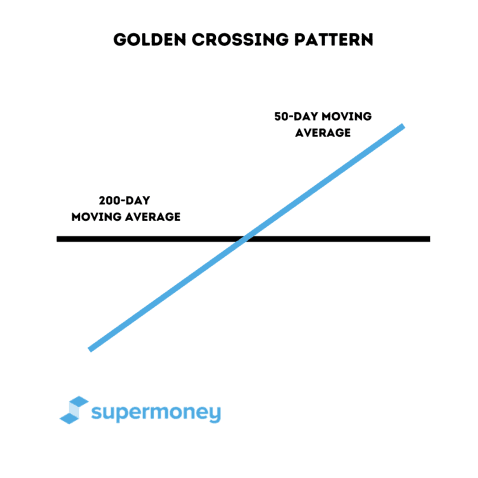
A golden crossing pattern is a stock trading chart pattern in which two lines converge on an upward trend, creating a cross. The cross occurs when the short-term moving day average starts to exceed the long-term moving day average. When the lines converge, this point is referred to as a golden cross. A golden cross is a reversal pattern that indicates that there is a strong uptrend leading to a long-term bull market.
When traders invest in the stock market, they use a variety of metrics in their technical analysis to determine which way the price of an asset might move. One aspect they will surely pay attention to is time. Traders will use something called a “moving average crossover” to determine the performance of an asset based on its short-term average performance vs. its long-term average performance. If these two averages cross in a certain way, it can indicate the direction of the market. The golden cross, if identified correctly, indicates a bullish uptrend over the long term. Just like other chart patterns, such as the double top/double bottom pattern, ascending triangle pattern, or cup and handle pattern, a golden cross helps traders decide when to buy or sell the asset.
Compare Brokerage Services
Compare multiple vetted providers. Discover your best option.
What is a candlestick pattern?
A candlestick pattern is a graphic representation of changes in price on a candlestick chart that some traders believe can predict future price movements. Bullish patterns predict increases in price, while bearish patterns indicate that the price may drop. Check out our in-depth article about how to read these charts and some other common patterns.
It’s important to note that there are no guarantees when using chart patterns in technical analysis. Chart patterns are only an indication of what might happen to an asset’s price.
What is a moving average?
A moving average is a tool used in technical analysis to determine an asset’s average price over a period of time. The time frame can be either a longer-term moving average, such as 200 days, or a short-term moving average, such as 20 or 50 days. Moving averages are used to eliminate as much noise as possible from the direction of an asset price so that trends can be determined in either direction. It’s also important to note that moving averages incorporate past prices and thus are considered a “lagging” indicator. That said, moving averages are used to develop a macro picture of how an asset’s price might trend over different periods of time.
What is a moving average crossover?
A moving average crossover is when two moving average lines converge at a point and cross each other. A moving average crossover always consists of a longer time frame crossing over a shorter time frame. If a shorter moving average trend line is heading down and the long-term moving average is flat or eventually trending down, the point at which they converge is called a death cross. This typically insinuates a long-term bear market. If a shorter-term average trend line trends up and a long-term moving average is also trending up, the point at which they converge is called a golden cross. A golden crossing pattern indicates a strong, long-term bull market will occur in the not-so-distant future.
What makes up a golden cross?
A golden cross can be made up of any two short-term vs. long-term time frames. However, many traders will use a long-term average of 200 days and a short-term average of 50 days when analyzing a golden cross. We will also use 50-day and 200-day averages when looking at golden crosses.
Some traders describe three stages of a golden cross, but we have divided it into four stages to be as clear as possible. A trader needs the following to confirm a golden cross.
Preceding downtrend
In most cases, a golden cross will be preceded by some sort of downtrend. It can be a short-term downtrend or a longer-term downtrend signaling the bottom of the market. As the downtrend begins to end, you should see the 50-day moving average move below the 200-day moving average. At some point, this short-term 50-day downtrend will have started to reverse, and the lines that make up the trend averages should start to trend upward. As the downtrend begins to end, you should see the 50-day moving average losing volume from the sellers. Once the price has hit bottom, you should see increased volume from the buy side.
Golden crosses can be great indicators of a bull market, but they can lag. It’s best to learn as much as possible before you invest. Here are some advisors that can help you get started making smart investments.
New short-term uptrend
Once the 50-day moving average price hits its bottom, it begins to trend upward. Just as it crossed below the 200-day moving average on the preceding downtrend, the new uptrend will eventually cross the 200-day moving average.
Pro Tip
It’s important to emphasize that when the golden cross occurs, the short-term trend line should be moving up, but the long-term trend line doesn’t need to be. In fact, because it incorporates more time into its average, the long-term trend line might be flat or slightly down. After a period of time, if the pattern is truly a golden gross, both the short-term and long-term trend lines will trend up.
Cross
Once the new 50-day moving average uptrend crosses the 200-day moving average trend line, it forms the golden cross. So even if the long-term moving average is flat or trending slightly down, as long as the short-term moving average crosses it, this could indicate a golden cross (if another uptrend follows it).
Upside breakout and continuing uptrend
Once the 50-day moving average and the 200-day moving average cross, the 50-day moving average should then continue upward. Eventually, the long-term 200-day average will start to move up, if it hasn’t already. Remember that the 200-day moving average has a lot more information from previous days of price action and thus will tend to lag.
Real-life example of a golden cross
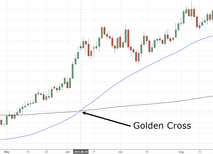
Here we can see a golden cross forming over time with the British pound vs. the Australian dollar. The golden cross occurs at the beginning of the chart, with a significant uptrend after that. The 50-day moving average really begins to trend up near the beginning of May, and the asset price rises significantly.
It does not cross the long-term moving average, however, until around the middle of June. After these lines form their golden cross, there is a consistent uptrend representing a prolonged bull market. If a trader decided to buy in May, the stock would have performed better than if he had waited until the golden cross formed. However, the trader may have wanted to wait for the cross to form to confirm the pattern. This is the primary issue traders face with the golden cross. As the pattern lags, traders are handcuffed from getting in at the earliest possible position if they want to confirm the pattern.
Why does a golden cross occur?
A golden cross will most likely occur at the end of some sort of downtrend, as explained above, either short-term or long-term. The downtrend consisted of sellers pushing the price of the asset down during the downtrend but starting to lose momentum as the downtrend nears the bottom. In many cases, you will see a drop in volume as the asset price bottoms out. Remember, when looking at immediate trends, we consider the 50-day moving average rather than the 200-day moving average, which is more accurate as to the current price movement.
Why does the short-term (50 days) move up quickly?
Once the bottom has been determined, you should see an uptick in volume and buy orders from the seller pushing the trend line up. This indicates that there is a consistent uptick in price over the shorter time frame contributing to the slightly higher-angled 50-day moving average. As the trend gains momentum, there should be an increase in high-trading volume from the buy side. This indicates that we are in store for a long-term bull market.
Why doesn’t the long-term average move up as quickly?
Remember, the long-term 200-day average uses data from 200 days, and the short-term average uses data from 50 days. This means there is more data that the 200-day average needs to incorporate, making the trend slower to form and react. This. This is why the 200-day moving average will sometimes be either flat or trend slightly down.
When would a trader open a trade?
A trader will open a trade with a golden cross at different points depending on his trading thesis and other technical indicators. Remember, these are moving averages. The asset price might move above the long-term moving average but still not have enough momentum for the 50-day moving average trend line to cross the 200-day average trend line. Traders who are extremely bullish on the asset and want to move aggressively will put in a buy order when the asset price (not the price average) breaks the 200-day trend average. More conservative traders will wait until the lines actually cross before putting in a buy order.
How traders manage the downside
Death crosses and golden crosses typically indicate long-term trades in which a market is due for a bear run or a bull run. However, if identified incorrectly, the pattern could represent another technical pattern. A more aggressive trader might even opt to put a stop loss at a price point below the breakout point and at a point when the average price is even lower than the breakout point. This gives them room to absorb deeper retest levels, with the thesis that no matter what, an upward trend will continue. A more conservative trader might opt for putting a stop loss above the breakout point. They might be fearful that any retest could, in fact, be a break to the downside, meaning this pattern was falsely identified.
When you’re ready to invest, these brokerages can help you determine where to put your money for the best results.
FAQ
Is a golden cross bullish or bearish?
A golden cross signals a bullish market and a longer-term bull trend. It is the opposite of when a death cross occurs, which indicates a longer-term bearish trend.
Does the golden cross strategy work?
Golden cross trading can work if the pattern is identified correctly. However, as the pattern consists of moving averages that can lag, traders might not get in at the absolute best time to buy the asset (the bottom). It should be used with various other forms of technical analysis to utilize its value.
What time frame is best for a golden cross?
Many traders consider the point when the 50-day term moving average crosses the 200-day moving average as the best time frame for a golden cross.
How do you use the golden cross strategy?
You will utilize a golden cross strategy if you have a bullish thesis on the asset, based on other technical analysis. You can use it as a strategy to determine when to get into the market.
Is the golden cross a good indicator?
As with most patterns, a golden cross should be utilized with various other forms of trading analysis. Golden cross trading strategies also incorporate data that consists of moving averages, which lag. However, it can be a good indicator that the market is in the process of a decently long bull run. It can be used to determine when to get into the market, similar to a double bottom pattern or a descending wedge pattern.
What happens after the golden cross?
After a golden cross occurs, the market should continue upward. There should be a quickly-increasing short-term moving average and a slower-increasing long-term moving average.
Key takeaways
- A golden cross pattern occurs when the short-term moving average crosses with a long-term moving average on an upward trend. The pattern is indicative of a longer-term bull market.
- In many cases, a golden cross occurs after a preceding minor or major downtrend. In this way, it indicates the bottoming out of the market and a switch to an uptrend.
- A golden cross will be accompanied by an increase of v0lume on the buy side, moving the trend line up as a bull market takes hold.
- It’s important to note that as the trend lines consist of averages over a period of time and not actual prices, they can tend to lag.
Share this post: